Index
- Trend Analysis
- Periodicity Analysis
- 🚩 What Is Periodicity?
- Lag in Time Series
- Autocorrelation Function (ACF)
- 🌡️ What Autocorrelation Values Mean
- Fourier Transform
- Now how on earth would one interpret this data?
- 💡 What Fourier Transform actually does
- Trend Analysis
- 1. Free-Hand Method ✍️ (Explanation Only)
- 2. Semi-Average Method
- 3. Moving Average Method
- Weighted Moving Averages
- 4. Fitting Mathematical Curves
- a. Linear Trend (Recap)
- b. Quadratic Trend
- Similarity Search
- 1. Euclidean Similarity Search
- 2. Dynamic Time Warping (DTW)
- 3. Cosine Similarity Search
Time Series Analysis
🕒 Time Series Analysis: Basics
🔹 What is a Time Series?
A time series is a sequence of data points indexed in time order. Typically, the data is collected at consistent intervals (e.g., daily stock prices, hourly temperature, monthly sales).
Example:
Time       Temperature (°C)
---------------------------
01:00      22.1
02:00      22.3
03:00      21.8
04:00      21.2
🔹 Why Analyze Time Series?
Time series analysis is used for:
- Forecasting (e.g., predicting future stock prices)
- Trend detection (e.g., increasing or decreasing behavior over time)
- Anomaly detection (e.g., detecting faults in equipment)
- Seasonal behavior (e.g., sales rising every December)
🧱 Components of a Time Series
Time series data is usually decomposed into the following key components:
1. Trend (Tt)
A long-term increase or decrease in the data. It doesn't have to be linear.
Example:
Gradual increase in global temperatures over years.
2. Seasonality (St)
A repeating pattern at regular intervals (hourly, daily, monthly, yearly).
It’s caused by seasonal factors like weather, holidays, habits, etc.
Example:
Higher ice cream sales in summer months every year.
3. Cyclic Patterns (Ct)
==These are long-term oscillations not fixed to a calendar.
Cycles are influenced by economic conditions, business cycles,== etc.
Difference from seasonality:
Seasonality is fixed and periodic; cycles are irregular and non-fixed.
4. Noise/Irregular (Et)
==Random variations or residuals left after removing other components.
Unpredictable and caused by unexpected or rare events== (e.g., pandemic).
📊 Types of Time Series Models
-
Additive Model:
Assumes the components add together:
Yt = Tt + St + Ct + Et -
Multiplicative Model:
Assumes the components multiply together:
Yt = Tt × St × Ct × Et
Use additive if the seasonal fluctuations remain constant in magnitude.
Use multiplicative if fluctuations increase with the level of the series.
🧠 Other Key Concepts
✅ Stationarity
A stationary time series has constant statistical properties over time (mean, variance, autocorrelation).
Stationarity is often required for many forecasting models (like ARIMA).
✅ Lag
How many steps back in time you're comparing data.
Lag helps in autocorrelation and feature engineering.
✅ Autocorrelation
How related current values are with past values in the series.
Helpful for modeling dependencies over time.
🧩 Real-World Applications
- Weather prediction
- Stock market forecasting
- Sales forecasting
- Network traffic monitoring
- Energy consumption trends
Periodicity Analysis
🚩 What Is Periodicity?
Periodicity is when a time series repeats a pattern at regular intervals. These intervals are called the period. Common examples:
- Daily temperature patterns
- Seasonal sales trends (e.g., spikes during Diwali or Christmas)
- Traffic congestion patterns during weekdays
If trends show an upward or downward movement, periodicity shows cyclic up-and-down movements at fixed durations.
🧠 Intuition
Imagine you’re tracking the number of coffee sales at a cafe every hour. You’ll likely see spikes in the morning and late afternoon — repeating every day. That’s a daily periodicity.
🔍 Identifying Periodicity
There are three key ways to detect periodicity:
- Visual Inspection: Plot the time series. Look for repeating patterns.
- Autocorrelation Function (ACF):
- Measures how similar the series is with itself at different lags.
- High ACF at a lag = possible periodicity at that interval.
- Fourier Transform:
- Converts time series from time-domain to frequency-domain.
- Helps us spot dominant frequencies (or periods).
- Output: Frequencies with high amplitudes indicate repeating cycles.
Lag in Time Series
A lag just means "how far back in time you look".
If you have a time series like this (let’s say it’s daily temperature):
| Day | Temp |
|---|---|
| 1 | 21°C |
| 2 | 23°C |
| 3 | 22°C |
| 4 | 24°C |
| 5 | 23°C |
| 6 | 25°C |
| 7 | 26°C |
Then:
- Lag 1 → compare today’s value with yesterday’s
- Lag 2 → compare today’s value with 2 days ago
- Lag 3 → compare today’s value with 3 days ago
- …and so on.
📊 Lag in Action
Let’s create Lag 1 version of this data:
| Day | Temp | Lag-1 Temp |
|---|---|---|
| 1 | 21°C | – |
| 2 | 23°C | 21°C |
| 3 | 22°C | 23°C |
| 4 | 24°C | 22°C |
| 5 | 23°C | 24°C |
| 6 | 25°C | 23°C |
| 7 | 26°C | 25°C |
What Exactly Did We Do in Lag 1?
Let’s say you’re on Day 4, and you want to know:
What was the temperature yesterday (i.e., Day 3)?
That’s what Lag 1 does — it shifts the original data downward by 1 step so that for each day, you can compare today’s value to the one from 1 day before.
So Lag-k would shift the data downwards by k steps
So here’s what it looks like in action:
Original Data:
| Day | Temp |
|---|---|
| 1 | 21 |
| 2 | 23 |
| 3 | 22 |
| 4 | 24 |
| 5 | 23 |
| 6 | 25 |
| 7 | 26 |
Create Lag-1 (Shift all Temps down by 1 row):
| Day | Temp | Lag-1 Temp |
|---|---|---|
| 1 | 21 | – |
| 2 | 23 | 21 |
| 3 | 22 | 23 |
| 4 | 24 | 22 |
| 5 | 23 | 24 |
| 6 | 25 | 23 |
| 7 | 26 | 25 |
Why the blank?
- Because Day 1 has no “previous day” to compare it with. That’s why the Lag-1 Temp is blank
- (or usually treated as
NaNin code).
🧠 What are we doing with this?
We’re preparing to measure:
“How similar is today’s temp to yesterday’s temp?”
If there’s a strong correlation between Temp and Lag-1 Temp, that means the series has memory — it depends on the past.
This concept becomes core when we do:
- Autocorrelation
- ACF plots
- Time-series forecasting (like ARIMA, which literally stands for Auto-Regressive Integrated Moving Average)
So, technically this is how a Lag-2 dataset would look like if we were comparing today’s temp with that of 2 days ago:
| Day | Temp | Lag-2 Temp |
|---|---|---|
| 1 | 21°C | – |
| 2 | 23°C | – |
| 3 | 22°C | 23°C |
| 4 | 24°C | 22°C |
| 5 | 23°C | 24°C |
| 6 | 25°C | 23°C |
| 7 | 26°C | 25°C |
Key rule : More blanks as value of n increases in a Lag-N dataset.
🧠 What’s going on?
- Day 3 now has Lag-2 Temp = 21°C, because that was the temperature on Day 1.
- Day 4 → Lag-2 = Day 2
- Day 5 → Lag-2 = Day 3, and so on…
⬇️ More Progressive Lag = More Missing Entries
Yep, and here’s a key point:
- Lag-1: First row is blank.
- Lag-2: First two rows are blank.
- Lag-n: First n rows will be blank (or
NaNin code).
Because you can’t look back beyond what data exists — so the higher the lag, the more initial data you lose from the top.
📘 Examples of What Lags Mean
- Lag 1: compare with yesterday → short-term effects (momentum, decay)
- Lag 7: compare with last week → weekly cycles
- Lag 12 (if monthly data): compare with same month last year → yearly seasonality
⚠️ Important Note:
You lose data points with each lag.
If your dataset has 100 entries, then for:
- Lag 1 → you get 99 valid comparisons
- Lag 2 → 98 comparisons
- …
- Lag k → (N - k) comparisons
Autocorrelation Function (ACF)
Autocorrelation (ACF) tells you how related a time series is with a lagged version of itself.
Imagine sliding the entire time series over itself by some number of time steps (called a lag) and checking how similar the series is to the original.
It’s like asking:
“Is today’s value similar to the value from 1 day ago? 2 days ago? 7 days ago?”
Formula:
Given a time series :
The autocorrelation at lag is :
Scary looking formula, I know. But things will clear up with a few examples.
🧩 What Do the Variables Mean?
| Symbol | Meaning |
|---|---|
| Value at time step (current value in the original time series) | |
| | Value at time step (value after lag k) |
| Mean of the entire time series (or just the part used in the sum) | |
| Autocorrelation at lag | |
| Total number of observations in the time series |
Note, to simplify the formula we sometimes re-write as
Example 1
To fully clear this out, let’s work on an example step by step, in detail :
🌡️ Time Series Data (Temperature)
| Day | Temp (X) |
|---|---|
| 1 | 21 |
| 2 | 23 |
| 3 | 22 |
| 4 | 24 |
| 5 | 23 |
| 6 | 25 |
| 7 | 26 |
Let’s say we want to find out the ACF at lag 1 ().
🔁 Step 1: Create lagged pairs for lag 1
We shift the temperature values by one day to get Lag-1 Temps:
Note that here for simplicity purposes we set
| Day | Temp () | Lag-1 Temp ( or ) |
|---|---|---|
| 2 | 23 | 21 |
| 3 | 22 | 23 |
| 4 | 24 | 22 |
| 5 | 23 | 24 |
| 6 | 25 | 23 |
| 7 | 26 | 25 |
Note that the table above would be the same as :
| Day | Temp () | Lag-1 Temp ( or ) |
|---|---|---|
| 1 | 21 | __ |
| 2 | 23 | 21 |
| 3 | 22 | 23 |
| 4 | 24 | 22 |
| 5 | 23 | 24 |
| 6 | 25 | 23 |
| 7 | 26 | 25 |
However in the previous table we just skipped the first row and started from Day 2.
So we now have 6 pairs:
- X =
[23, 22, 24, 23, 25, 26] - Y =
[21, 23, 22, 24, 23, 25]
🧮 Step 2: Calculate the mean ( and )
This is a one time calculation
Step 3: Calculate each part of the formula
Numerator:
Now hold on a minute.
Why was replaced with ? Why feel the need to do that?
Without confusing you too much, just for simplicity purposes, know this, that when we assigned as , the associated term with it’s components:
in numerator and:
will also be replaced with a component for “consistency purposes”.
Otherwise if you need more detailed explanation you can ask any AI but the answer you will get, will most certainly fry your brain (trust me, I tried it, didn’t understand).
So let’s stick to just knowing the formulae here:
Denominator:
Let’s calculate everything in a table.
Remember we have :
And the table as:
| i | |||||||
|---|---|---|---|---|---|---|---|
| 1 | 23 | 21 | |||||
| 2 | 22 | 23 | |||||
| 3 | 24 | 22 | |||||
| 4 | 23 | 24 | |||||
| 5 | 25 | 23 | |||||
| 6 | 26 | 25 |
So now we start filling the values :
So for it will be each value in a cell of
And for , it will be each value in a cell of
| i | |||||||
|---|---|---|---|---|---|---|---|
| 1 | 23 | 21 | -0.83 | -2.0 | |||
| 2 | 22 | 23 | -1.83 | 0.0 | |||
| 3 | 24 | 22 | 0.17 | -1.0 | |||
| 4 | 23 | 24 | -0.83 | 1.0 | |||
| 5 | 25 | 23 | 1.17 | 0.0 | |||
| 6 | 26 | 25 | 2.17 | 2.0 |
Now the remaining columns are easier.
is just the product of the values of each cell of the two columns we just calculated.
is just the square of the values of the first column we calculated.
is just the square of the values of the second column we calculated.
So, the table is now:
| i | |||||||
|---|---|---|---|---|---|---|---|
| 1 | 23 | 21 | -0.83 | -2.0 | 1.66 | 0.6889 | 4.0 |
| 2 | 22 | 23 | -1.83 | 0.0 | 0.0 | 3.3489 | 0.0 |
| 3 | 24 | 22 | 0.17 | -1.0 | -0.17 | 0.0289 | 1.0 |
| 4 | 23 | 24 | -0.83 | 1.0 | -0.83 | 0.6889 | 1.0 |
| 5 | 25 | 23 | 1.17 | 0.0 | 0.0 | 1.3689 | 0.0 |
| 6 | 26 | 25 | 2.17 | 2.0 | 4.34 | 4.7089 | 4.0 |
Now for the numerator:
It’s just the sum of the values in the column of
So :
And the denominator:
It’s just the square root of the product of the sums of all the values in and respectively
So :
So denominator :
✅ Step 4 : Final ACF at lag 1:
🧠 Intuition
- means there’s a moderate positive autocorrelation — temperature values are somewhat correlated with the values one day before.
Let’s try for lag 2.
So our lag 2 dataset will look like this:
| Day | Temp () | Lag-2 Temp () |
|---|---|---|
| 3 | 22 | 21 |
| 4 | 24 | 23 |
| 5 | 23 | 22 |
| 6 | 25 | 24 |
| 7 | 26 | 23 |
Now we have 5 pairs
- X =
[22, 24, 23, 25, 26] - Y =
[21, 23, 22, 24, 23]
Let’s find the mean
Now let’s calculate everything in the formula :
| i | |||||||
|---|---|---|---|---|---|---|---|
| 1 | 22 | 21 | -2 | -1.6 | 3.2 | 4 | 2.56 |
| 2 | 24 | 23 | 0 | 0.4 | 0 | 0 | 0.16 |
| 3 | 23 | 22 | -1 | -0.6 | 0.6 | 1 | 0.36 |
| 4 | 25 | 24 | 1 | 1.4 | 1.4 | 1 | 1.96 |
| 5 | 26 | 23 | 2 | 0.4 | 0.8 | 4 | 0.16 |
Now for the numerator:
And for the denominator :
So,
✅ Intuition:
That’s a strong positive correlation at lag 2 — the temperature values from 2 days ago are quite predictive of today’s temperature. Makes sense for slow-changing weather.
How are we interpreting this?
🌡️ What Autocorrelation Values Mean
Autocorrelation (at lag k) measures how similar the time series is to a shifted version of itself by k steps.
- → Perfect positive correlation: if the value k days ago went up, today also goes up in the same proportion. A perfect match.
- → No correlation: the past values have no influence on today’s value.
- → Perfect negative correlation: today’s values are the opposite of what happened k days ago.
| Correlation Value | Interpretation |
|---|---|
| 0.9 to 1.0 | Strong correlation (very similar) |
| 0.7 to 0.9 | Moderate to strong |
| 0.4 to 0.7 | Moderate |
| 0.2 to 0.4 | Weak |
| 0.0 to 0.2 | Very weak or no correlation |
| < 0 | Inverse correlation |
Fourier Transform
At its heart, Fourier Transform (FT) answers this question:
“If this signal is made of waves, what waves is it made of?”
It takes a time-based signal (like temperature across days) and tells you:
- What frequencies (repeating patterns) are present.
- How strong each of those frequencies is.
🎛️ Analogy: Music and a Piano
Imagine a song is playing. You don’t just hear random noise — you hear notes.
Each note is a pure frequency (like 440 Hz for A4).
What the Fourier Transform does is like:
- Listening to the song,
- Identifying each note being played (frequencies),
- And telling you how loud each note is (amplitude).
Given a discrete signal (e.g., daily temperatures):
The Discrete Fourier Transform (DFT) is defined as
where:
- is the strength of frequency ,
- is your original data (e.g., temperature at day ),
- is a complex wave function (sinusoids!).
Don’t worry if that looks scary. We’ll break it down visually and practically.
So, a few points before we proceed :
1. What does do?
In
Quick recap over what’s frequency, oscillations, cycles :
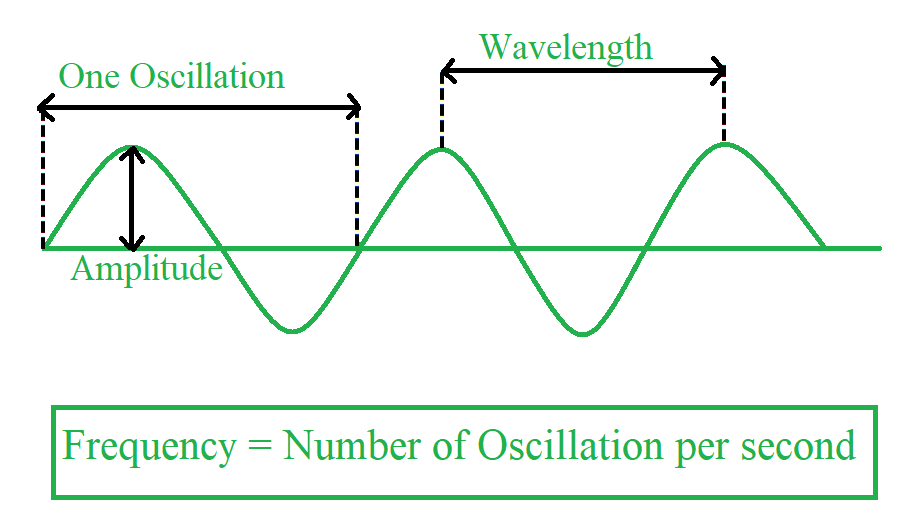
The frequency of a signal or wave is the number of complete cycles or oscillations that occur within a given time period. It is measured in Hertz (Hz), where 1 Hz represents one cycle per second. Think of it as how many times a wave crest passes a point in a second.
- is the frequency index.
- It tells you how many full oscillations (waves) occur across the full length of the signal.
- In a signal of length , means no oscillation (just the average), while is the highest frequency you can detect (one sample per half-cycle — the Nyquist frequency).
- So each tells you how much of frequency exists in your signal.
For example, with our 4-point signal:
| Day () | Temp () |
|---|---|
| 0 | 21 |
| 1 | 23 |
| 2 | 22 |
| 3 | 24 |
- : mean or DC component
- : slow wave that completes 1 full cycle over 4 samples
- : faster wave that completes 2 full cycles over 4 samples
- : completes 3 cycles — it’s actually symmetric to
Now, let’s see what frequency means when we are performing DFT in periodicity analysis
In DFT, we’re not talking about physical Hz (like “times per second”) unless you’re sampling over time. Instead, the frequency index corresponds to how many complete cycles (oscillations) fit into your data length .
So this means that
For
- You’ll get 4 frequency components:
- They represent 0 to 3 cycles per
So k is basically the number of oscillations of a complex wave over the total N data points.
2. Why do we write as ? (pronounced as omega)
This is a shorthand used in Fourier theory.
It’s done so that the formula becomes simple:
Instead of re-computing the exponential every time, we reuse and just raise it to powers.
It’s like a complex unit circle step — taking , and rotating it times around the unit circle.
3. What are the powers of and why do they rotate?
Since we use instead of calculating an exponent and rotating it times, depends on a complex unit circle
This is because:
- lies on the complex unit circle
- Raising to a power rotates it by some angle:
These are called the roots of unity — they loop around the circle and repeat every steps.
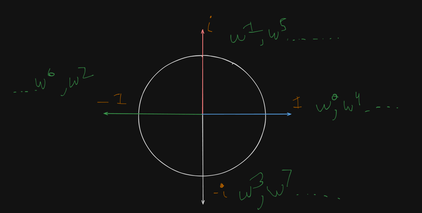
So for , the powers are:
| Power | Value | On Complex Plane |
|---|---|---|
| Right (real axis) | ||
| Top (imaginary axis) | ||
| Left | ||
| Bottom | ||
| again! | Full circle |
And so on, for increasing values.
🔍 What You’ll See
Fourier Transform gives us a spectrum:
- X-axis: Frequency (e.g., cycles per day)
- Y-axis: Strength of that frequency
High peaks? → Strong repeating patterns at that frequency.
Flat? → No strong repeating patterns.
Example
🔢 Sample Time Series
Let’s take 4 data points from a temperature time series:
| Day () | Temp () |
|---|---|
| 0 | 21 |
| 1 | 23 |
| 2 | 22 |
| 3 | 24 |
Let , so .
Now we define the shared variables
| Power | Value | On Complex Plane |
|---|---|---|
| Right (real axis) | ||
| Top (imaginary axis) | ||
| Left | ||
| Bottom | ||
| again! | Full circle | |
| Top (imaginary axis) | ||
| Left | ||
| Bottom | ||
| 1 | Full circle | |
| Top | ||
| Left | ||
| Bottom | ||
| 1 | Full circle |
and
So we start calculating terms one by one
Now we have , so
Now for
So,
Similarly for
Similarly for
Now how on earth would one interpret this data?
🧠 First: What are you even trying to do with Fourier?
You’re saying:
“I have some time-based data, like temperature each day. I want to know: Does it seem to repeat every few days?”
Like maybe it tends to warm up every 3rd day? Or every 7 days?
💡 What Fourier Transform actually does
Think of Fourier Transform as a smart assistant that asks your data:
“If I imagine the temperature was caused by some regular up-and-down patterns… which patterns could explain it?”
Then it tries many different rhythms (called “frequencies”) and checks:
- “How strong is this pattern in your data?”
Each Xₖ term tells you:
- How much of the pattern that repeats every N/k days exists in your data.
🧃 Let’s break it with a juice example (non-physics)
Imagine you’re tasting a fruit juice that’s made from:
- Apple (stable, always there)
- Lime (comes in a sharp burst every 2 sips)
- Orange (comes in a smoother, repeating every 3 sips)
You take 6 sips.
Fourier Transform says:
- 🧃 “Okay, the overall average flavor is apple = X₀.”
- 🍋 “I detect some lime that repeats every 2 sips = X₃.”
- 🍊 “I detect a bit of orange that shows up every 3 sips = X₂.”
You didn’t need to know anything about waves. You just know: if the numbers in X₂ and X₃ are big, then those patterns are strong.
🔢 Apply this to the temperature data
Let’s say you collect 7 days of temperature. You do a Fourier Transform, and the result shows:
| X index | Meaning | Value |
|---|---|---|
| X₀ | Average temp | 21.3 |
| X₁ | Every 7 days | 1.2 |
| X₂ | Every 3.5 days | 3.8 |
| X₃ | Every ~2.3 days | 0.4 |
| X₄ | Every ~1.75 days | 0.1 |
From this, you see:
- X₀ is big: There’s a stable average.
- X₂ is kinda big: There seems to be a small repeating rise/fall every 3–4 days.
- Others are small: No strong repetition every 2 or 7 days.
✅ Summary: How Fourier helps find repeating behavior
You don’t need to think in frequency or waves.
All you’re doing is:
🧍 “Hey data, do you have patterns that repeat every k days?”
📊 Fourier replies: “Yeah, a bit every 3 days, but not much every 2 or 7.”
That’s it. That’s what you read from the magnitudes of the X terms (ignoring imaginary parts for now).
🧠 Use-Cases
- Forecasting seasonal sales
- Detecting cyclical anomalies (like weekly fraud patterns)
- Predicting periodic traffic surges
🧩 Tip
Periodicity is different from seasonality:
- Seasonality = known, calendar-based periodicity (e.g., every December)
- Periodicity = general repeating pattern (can be weekly, monthly, etc.)
Trend Analysis
Now that we’ve looked at repeating patterns (periodicity) using tools like autocorrelation and Fourier, trend analysis helps us answer this:
🚶♂️ Is the data generally moving up, down, or staying flat over time?
Think of trend like the overall direction the data is heading — regardless of small fluctuations or cycles.
🧭 What Trend Actually Means
Imagine temperature data for 30 days. If it’s slowly increasing over time (like winter turning to spring), that’s an upward trend.
If it’s slowly decreasing (like summer ending), that’s a downward trend.
If it wobbles around a flat average (like no seasonal change), there’s no trend.
Methods for measurement of Trends
Generally, we have 4 traditional methods of measuring trends.
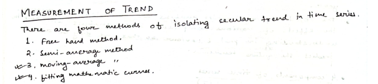
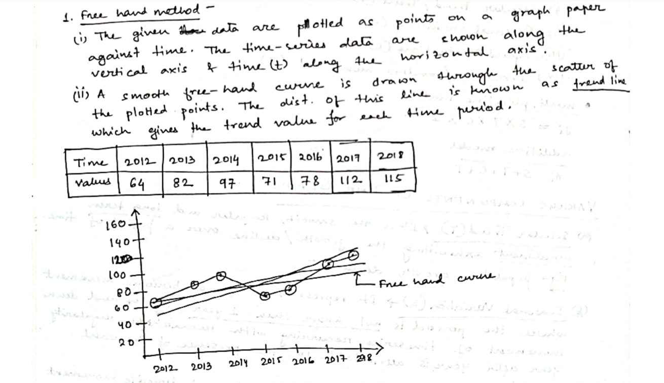
1. Free-Hand Method ✍️ (Explanation Only)
Since this is a visual method, imagine plotting the points and then drawing a smooth curve through them. It would show a gentle upward trend.
🧠 Used mostly for quick inspection. No exact math involved. No plotting needed unless you want to practice curve-drawing by hand.
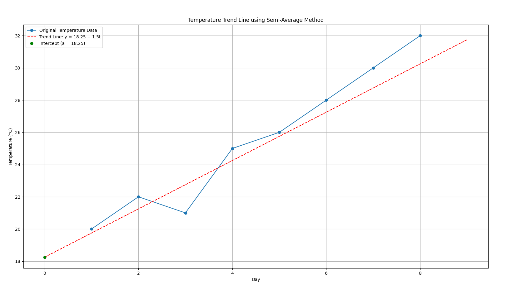
2. Semi-Average Method
Let’s walk through with a sample dataset
| Day | Temp (°C) |
|---|---|
| 1 | 20 |
| 2 | 21 |
| 3 | 23 |
| 4 | 24 |
| 5 | 26 |
| 6 | 27 |
| 7 | 29 |
| 8 | 30 |
Step 1: Divide the data into 2 halves
Since we have 8 data points (even number), we divide them into two equal parts:
- First Half (Days 1 to 4): 20, 21, 23, 24
- Second Half (Days 5 to 8): 26, 27, 29, 30
Step 2: Calculate the average of each half
First half average:
Second half average:
Step 3: Assign the averages to the mid-points of their respective halves.
First half ranges from days to .
So the mid-point of this half would be :
Second half ranges from days to .
So the mid-point of this half would be :
Step 4: Equation of the trend line
We have this equation of a trend line:
🧠 What do the variables mean?
| Symbol | Meaning |
|---|---|
y | Temperature (or the value we want to estimate) |
t | Time (usually in days or time units) |
a | Intercept of the line (value when time = 0) |
b | Slope of the line (how much temp or the value we are estimating, increases per unit of time) |
What do you mean by an “intercept of a line”?
The intercept of a line, in this equation, to be specific, a y-intercept is basically:
📌 What is the intercept of a line, mathematically?
In a linear equation of the form:
- is the output or dependent variable (in our case: temperature).
- is the input or independent variable (in our case: day number).
- is the slope of the line (how much changes when increases by 1).
- is the intercept, more specifically:
The intercept is:
The value of when
That is:
when
It tells you where the line cuts the vertical (y) axis — the starting value before any changes due to the slope.
Why does this matter?
The intercept gives a reference point for your trend. It’s like saying:
“If this upward/downward trend had always existed, what would the value be at time zero?”
You don’t always need to trust this value (especially when Day 0 isn’t in your dataset), but it’s crucial for defining a full line equation.
We now fit a straight line between these two points:
Point 1: (2.5, 22)
Point 2: (6.5, 28)
Use the slope formula:
And plug the value of into this equation :
Use (2.5, 22) to find .
✅ Final Trend Line Equation:
Now I believe you might have a few questions, such as:
🎯 Why do we plug in y = 22 and t = 2.5?
You calculated the first average as 22, and that average came from the first half, centered at day 2.5. So this gives us a real point on the trend line:
We already know b = 1.5, so to find a, we just plug this into the formula:
So the final trend line equation becomes :
🤔 Why do we keep t in the final equation?
Because the trend line isn’t just for one point—it's a formula you can use to predict or visualize the trend over time. You plug in different t values (days) to see how the temperature is expected to behave according to the trend.
For example
- At day
t = 1, predicted temp =18.25 + 1.5×1 = 19.75 - At day
t = 4, predicted temp =18.25 + 1.5×4 = 24.25 - At day
t = 8, predicted temp =18.25 + 1.5×8 = 30.25
So we see a steadily increasing trend over time, which says that the temperature is increasing as the days pass.
Here’s a visualization for better understanding of the increasing trend.
3. Moving Average Method
This method smooths out short-term fluctuations to reveal longer-term trends in the dataset. It works by averaging a fixed number of consecutive data points and sliding the window forward.
In short: This method is used to detect long term trends in the dataset, but short-term trends or “local trends” are not so well depicted in this method.
Step 1 : Pick a window size (e.g., 3-point moving average)
Before we proceed however, here’s some pre-requisites to know about this method:
💡 What is “Window Size”?
The window size (also called “period”) is the number of data points used to calculate each average.
So when we say:
- 3-point Moving Average, we are using 3 consecutive values from the data to calculate a single average.
- 5-point Moving Average means using 5 consecutive values per average.
It’s called a “moving” average because you slide this “window” across the data one step at a time.
So let’s say we are working with our temperature dataset again:
| Day | Temp |
|---|---|
| 1 | 20 |
| 2 | 22 |
| 3 | 19 |
| 4 | 21 |
| 5 | 24 |
If we use a 3-point moving average, then:
-
First, place the “window” over Day 1 to Day 3:
(20 + 22 + 19)/3 → 20.33 -
Slide the window to Day 2 to Day 4:
(22 + 19 + 21)/3 → 20.67 -
Slide again to Day 3 to Day 5:
(19 + 21 + 24)/3 → 21.33
Now some of you might be confused, thinking: Why are we doing this? Why choose Day 1 to Day 3, then 2 to 4, then 3 to 5, and heck, what are we even going to do with these values??
🌊 Why slide the window like that?
When we use a 3-point moving average, the window shifts one step forward each time. That’s the key idea:
- First average: Day 1, 2, 3
- Then: Day 2, 3, 4
- Then: Day 3, 4, 5
- And so on…
This overlapping window captures how the trend is changing over time, not just what it is in isolated chunks.
So it’s not that we’re jumping to random sets of days—it’s that we’re sliding the window one step at a time, like scanning a timeline gradually.
So the shifting can be demonstrated like this:
1 2 3
  2 3 4
    3 4 5
      4 5 ...
Notice how we are “sliding” a window across, the window in question having a space of 3 points only, that’s we pick 3 points at a time.
This overlapping window captures how the trend is changing over time, not just what it is in isolated chunks.
So it’s not that we’re jumping to random sets of days—it’s that we’re sliding the window one step at a time, like scanning a timeline gradually.
🤔 Why pick “3” as the window size?
There’s no fixed rule, but here are some guidelines:
| Window Size | What It Does | When to Use |
|---|---|---|
| Small (e.g., 3) | Reacts quickly to recent changes | Short-term trend, sensitive to noise |
| Medium (e.g., 5 or 7) | Balances noise reduction & responsiveness | General trend observation |
| Large (e.g., 10+) | Smoothes out a lot of noise | Long-term trend, may miss short fluctuations |
📉 What do we do with these moving average values?
Each average you compute becomes a smoothed version of your original dataset.
You can:
- Plot them on a graph alongside the original temperatures to observe how the general trend behaves.
- Use them to reduce noise or daily fluctuation, helping you spot underlying long-term patterns.
Here’s a quick comparison:
| Day Range | Average Temp |
|---|---|
| Day 1 to 3 | 20.33 |
| Day 2 to 4 | 20.67 |
| Day 3 to 5 | 21.33 |
If you plot those average temps at the middle day (e.g., Day 2, Day 3, Day 4), you start seeing a smoother line than the original, spiky temperature values.
Now, back to where we were:
Step 2: Assign the averages to a central point
Just like we did in semi-averages, we calculate the mean of the range of days assigned to an average, and assign the average temps to a specific day with each of their ranges respectively
So,
| Day Range | Average Temp | Central Point |
|---|---|---|
| Day 1 to 3 | 20.33 | 2 (Day 2) |
| Day 2 to 4 | 20.67 | 3 (Day 3) |
| Day 3 to 5 | 21.33 | 4 (Day 4) |
Step 3: Plot the data on a graph to observe the trend.
There can be two ways of plotting this data.
Option A: If you’re just interested in seeing the trend visually, no need to fit a line — just plot the moving average points. This already smooths out short-term fluctuations and shows the trend clearly.
This means just get a graph paper and directly plot the data in the above table.
which would look like this:
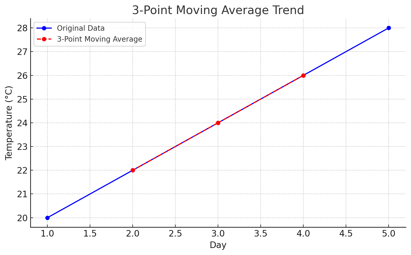
This smoothed red line represents the general trend by reducing the “noise” from smaller fluctuations. It helps visualize whether the overall direction is increasing, decreasing, or stable.
Here’s how a 4-point and 5-point moving average would look like
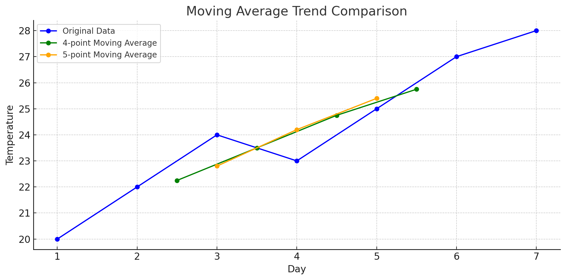
You can see how increasing the window size smooths the curve even more, revealing a clearer long-term trend but at the cost of local detail.
So one can question: What do we get by increasing the window size?
🧠 What You Get by Increasing Window Size:
-
More Smoothing:
- Larger windows reduce short-term fluctuations or “noise”.
- You get a cleaner view of the overall trend — like removing the tiny wiggles to see the mountain slope.
-
Slower Responsiveness:
- The trend reacts more slowly to new changes in data.
- Sudden spikes or drops are dampened — which might be good or bad depending on your goal.
-
Less Detail:
- Local variations, cycles, or patterns get smoothed out and possibly lost.
- If you’re analyzing short-term patterns, a large window might hide them.
Option B: If you’re curious about quantifying the trend (e.g., how fast temperature is increasing on average), then you can fit a linear model:
Like how we did in semi-averages.
Where:
y= temperature (moving average)t= day (e.g., 2, 3, 4)b= slope (how much the temperature is rising/falling per day)a= value of y when t = 0 (intercept)
🔍 Moving Averages — Trade-off Summary:
| Aspect | Small Window | Large Window |
|---|---|---|
| 📈 Reacts to changes | Quickly | Slowly |
| 🔊 Shows noise | Yes (more visible) | No (smoothed out) |
| 🔍 Detects short trends | Better | Poorly |
| 🌄 Detects long trends | Less clearly | Clearly |
Weighted Moving Averages
In a weighted moving average (WMA),
- Different points are treated differently — some are considered more important.
- Each point is multiplied by a weight depending on its importance.
- After multiplying, you sum them up and then divide by the total of the weights.
Key:
- You don’t divide by number of points anymore.
- You divide by the sum of the weights you assigned.
🧠 3. Why divide by sum of weights and not just number of points?
👉 Because after weighting, the total “amount” you are summing is not evenly spread.
Some points have more pull and some less.
If you divided by just 3, the number of points, you would completely ignore the fact that the middle point was counted twice as heavily as the others!
Instead, by dividing by 1+2+1 = 4,
you normalize the weighted sum back into a “proper average.”
🛠️ Simple Weighted Moving Average example:
Let’s say we have this dataset
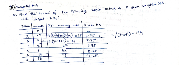
We are asked to find the trend using a 3-year WMA, of weights 1, 2, 1
So we have a window size of 3 points.
So let’s say for the first 3 years :
2 (Year 1), 4 (Year 2), 5 (Year 3)
And weights are 1, 2, 1.
Steps:
-
Weighted sum = (2 × 1) + (4 × 2) + (5 × 1)
= 2 + 8 + 5
= 15 -
Total weights = 1 + 2 + 1 = 4
-
Weighted average = 15 / 4 = 3.75
✅ Notice: If you just divided by 3, the higher importance you gave to 4 would be lost. That’s why we divide by 4, the total weights.
Example 2
Let’s try out a sample real-world example
Imagine you’re a teacher.
A student has taken three tests this semester:
| Test | Score | Importance (Weight) |
|---|---|---|
| Test 1 | 70 | 1 (not very important) |
| Test 2 | 80 | 2 (midterm, more important) |
| Test 3 | 90 | 1 (normal test again) |
Now, how should you calculate the student’s final average?
-
If you just do simple average:
(70 + 80 + 90) / 3 = 80 -
But that’s not fair because the Midterm (Test 2) is way more important than the others!
So, it appears we are at a conundrum (pronounced : “ko-none-drum”) now.
Luckily, we have weighted moving averages to work with!
🛠️ Using Weighted Moving Average (WMA):
Step 1: Multiply each score by its weight:
- 70 × 1 = 70
- 80 × 2 = 160
- 90 × 1 = 90
Step 2: Add them up:
- 70 + 160 + 90 = 320
Step 3: Add the weights:
- 1 + 2 + 1 = 4
Step 4: Weighted average:
- 320 ÷ 4 = 80
Final Weighted Average = 80
✅ In this case, luckily it came out the same as simple average.
But if the midterm score were lower or higher, the weighted average would reflect the “importance” properly!
For example, if the midterm was 60 instead of 80:
- Weighted sum = (70×1) + (60×2) + (90×1) = 70 + 120 + 90 = 280
- Weighted average = 280 ÷ 4 = 70
👉 You see, now the low midterm score pulled the average down more than it would in a simple average!
Here’s a more clear difference using a plot:
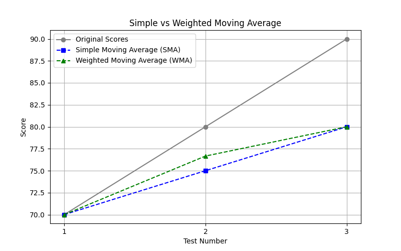
-
Gray Line (Original Scores):
This plots the raw data points: your original scores were 70, 80, 90. -
Blue Line (Simple Moving Average - SMA):
SMA treats all data points equally.
It smooths the values without giving preference to any particular test.
Notice how it averages things out slowly and consistently. -
Green Line (Weighted Moving Average - WMA):
WMA puts more importance on certain points (like more weight to the recent ones).
Because of this, it reacts a little faster to increases or decreases in your scores.
(Here we gave the second test the highest weight.)
That’s why the green line (WMA) is leaning slightly higher on the second test since it had more importance
Why do they look close but not identical?
-
In this small dataset (only 3 points), both SMA and WMA are fairly close, but WMA leans slightly towards the score that was given more weight (in this case, Test 2 got more focus).
-
As you work with larger datasets, WMA starts showing sharper responsiveness to local changes, while SMA keeps things much smoother.
👉 Summary:
- SMA = smooth, treats all points fairly.
- WMA = sharper, reacts faster by giving preference to more important points.
🧠 Conclusion
Weighted Moving Average is super useful when:
- Some values/events are more important than others.
- You want to make sure important things influence the trend more.
4. Fitting Mathematical Curves
This method is about fitting a curve (not just a straight line) to the data when trends are non-linear — that is, when the data doesn’t increase or decrease at a constant rate.
🔸 When Do We Use This?
When your data follows a pattern that’s:
- Linear (e.g., steadily increasing/decreasing trend)
- Quadratic (e.g., growth then decline like a parabola)
- Exponential (e.g., rapid growth or decay)
- Logarithmic
- Polynomial (higher-order trends)
🔸 The Basic Idea
Instead of fitting a line like y = a + bt, we fit equations like:
-
Linear trend:
y = a + bt -
Quadratic curve:
y = a + bt + ct² -
Exponential curve:
y = a * e^(bt) -
Logarithmic curve:
y = a + b * log(t)
We try to find the best-fitting coefficients (a, b, c, etc.) so the curve goes through or near the data points.
🛠️ How we usually do Curve Fitting:
- Choose the type of curve based on how your data looks.
- Use formulas (or regression) to calculate the parameters (like , , ).
- Plot the curve along with the original data points.
- Check the fit — does it match the trend well?
a. Linear Trend (Recap)
The equation for a linear trend is:
🧠 What do the variables mean?
| Symbol | Meaning |
|---|---|
y | Temperature (or the value we want to estimate) |
t | Time (usually in days or time units) |
a | Intercept of the line (value when time = 0) |
b | Slope of the line (how much temp or the value we are estimating, increases per unit of time) |
To understand what an intercept means just head back to What do you mean by an “intercept of a line”?
How to calculate and ?
We already did this once in the Semi-Average method where we had two points:
We now fit a straight line between these two points:
Point 1: (2.5, 22)
Point 2: (6.5, 28)
Use the slope formula:
And plug the value of into this equation :
Use (2.5, 22) to find .
However, for the curious ones, there is another, more general way to find and
Using these formulae:
where = number of data points.
This method is called the least squares regression method.
Now the question one can ask is:
Which method to choose?
Well the previous method works better for semi-average only when you have two points to deal with.
In the case when you are working with a more broad dataset and want to plot a linear trend to see how it looks, you will need to use the least squares regression method.
So, a few more points about this method.
While calculating b:
Where:
- = number of points times the sum of each t*y
- = product of total t and total y
- = number of points times sum of each t squared
- = square of total t
What is here?
Let’s say we have this dataset again:
| Day | Temp (°C) |
|---|---|
| 1 | 20 |
| 2 | 21 |
| 3 | 23 |
| 4 | 24 |
| 5 | 26 |
| 6 | 27 |
| 7 | 29 |
| 8 | 30 |
is just each temperature value, corresponding to each value on the dataset.
And for a:
It’s just the sum of all y values minus b times sum of all t values divided by the total number of table entries.
Now, one might have this question:
Are the a and b values calculated using the method for semi-average plotting, the same as the a and b values calculated using the least squares regression method?
And the answer is: no, they are not the same.
🔵 1. Slope between two points (basic method you mentioned):
- When you just take two points and ,
- The slope is simply:
- And then you can substitute back into to find .
👉 But this method uses only two points to define the line.
🔵 2. Slope via Least Squares (the one we are doing now):
- Here we are fitting the best line through ALL the points.
- We are minimizing the total squared error (the vertical distances from the line).
- This method balances all the points — not just two!
- That’s why the formulas look more “global,” involving sums like :
🔵 Therefore:
- YES, the and values will usually be different between the two methods.
- The two-points method might only match the least-squares method if all points happen to lie exactly on one perfect straight line (very rare in real-world data).
- Otherwise, least squares gives a much better, more fair trend line for multiple data points.
For a quick comparison, let’s see a visual plot using both methods.
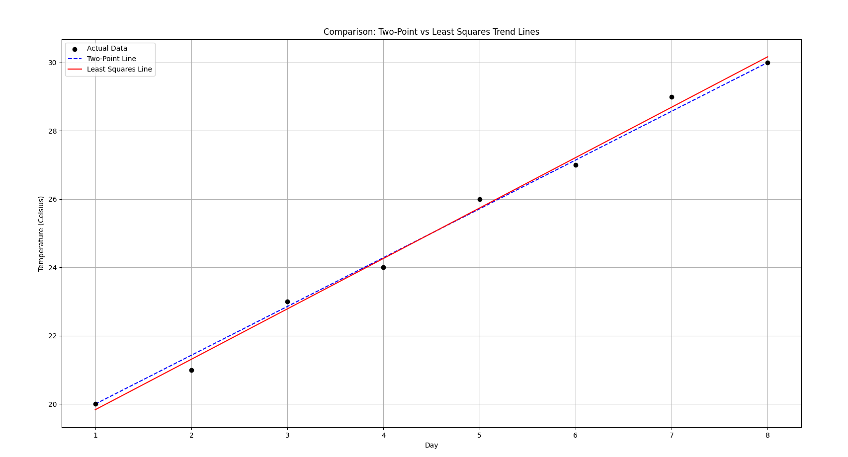
Now what does this image imply?
See how the red line is a bit off in the starting and the end?
Red Solid Line = The Least Squares Line (Linear Regression):
- It uses all the data points.
- It minimizes the overall error (the total of all the vertical distances between the points and the line).
- It’s more reliable for making predictions across the whole range.
And the blue-dotted line is the two-point line method.
🔹 Blue Dashed Line = The Two-Point Line:
- It only uses the first and last points (Day 1 and Day 8) to create a straight line.
- It’s simple, quick, but less accurate because it ignores the middle points.
What this plot implies:
- Both lines look similar because the data is fairly linear and clean.
- But the red line (Least Squares) is slightly better because it fits all points and doesn’t just pass through the first and last points.
- If your data was noisy, the two-point line would be way off, while Least Squares would still balance out the fluctuations nicely.
b. Quadratic Trend
Quadratic Trend Model is used when the data shows curvature — meaning the trend is not a straight line but curves upward or downward like a parabola.
The general form of the quadratic trend equation is:
where:
- = value of the dependent variable at time
- = time (or any independent variable)
- = intercept (value of when t=0)
- = linear coefficient (captures the straight-line part)
- = quadratic coefficient (captures the curvature)
How does one fit a Quadratic Trend?
We generally use the Least squares regression method to find the best values of , and , such that the sum of squared differences between actual and predicted is minimized.
You set up and solve the following system of normal equations:
where:
- is the number of observations (total number of entries in the table).
- The summations () are over the dataset.
Firstly, compute all the sum values, and construct the three equations.
Solve for , and using linear algebra techniques (substitution, matrices, etc.)
Intuition Check
- If , the curve opens upward (like a “U” shape).
- If , the curve opens downward (like an upside-down “U”).
- The bigger the value, the steeper the curvature.
This type of trend is helpful in:
- Economics (e.g., GDP growing faster over time)
- Natural sciences (e.g., population growth then decline)
- Market analysis (e.g., rise and fall in demand)
Example 1
Suppose, we have:
| (Time) | (Value) |
|---|---|
| 1 | 4 |
| 2 | 7 |
| 3 | 12 |
| 4 | 19 |
| 5 | 28 |
So,
Now we reconstruct the equations
First equation is just the same as the original one :
So we have equation 1 as:
Second equation is just a progression of equation 1.
So we have equation 2 as:
Third equation is just a progression of equation 2.
So we have equation 3 as:
So we have the system of equations as:
Now this can be a good exercise for us to solve this system using matrices, the matrix inversion method to be specific
So let’s write this system of equations as matrices:
as the matrix
and
as the matrix
and
as the matrix
We need to find :
Firstly we find the matrix of minors:
We have our original matrix as:
Firstly we compute the determinant of this matrix:
So our matrix of minors will be:
(That was quite painful to type and render, but atleast faster than drawing with a mouse).
Now we solve the individual determinants :
So this is the matrix of minors.
Now we apply the sign scheme to get the co-factor matrix:
Now we find the adjugate matrix by transposing the co-factor matrix :
Now we compute the inverse of the matrix :
(There might be some rounding errors here but I purposely did that to keep the numbers small)
Now using the formula:
For , multiply each element of to each element of the first row of and add :
(corrected, was previously , since I multiplied , lol) (This mistake however, will prove useful below, as you will see)
So we have the solution to the system of equations as:
So, the quadratic equation for this dataset:
will be:
Since we have our , we should expect an upward “U” shape in the visualization.
Here’s a visualization of the quadratic trend for my previously mistaken calculated value.
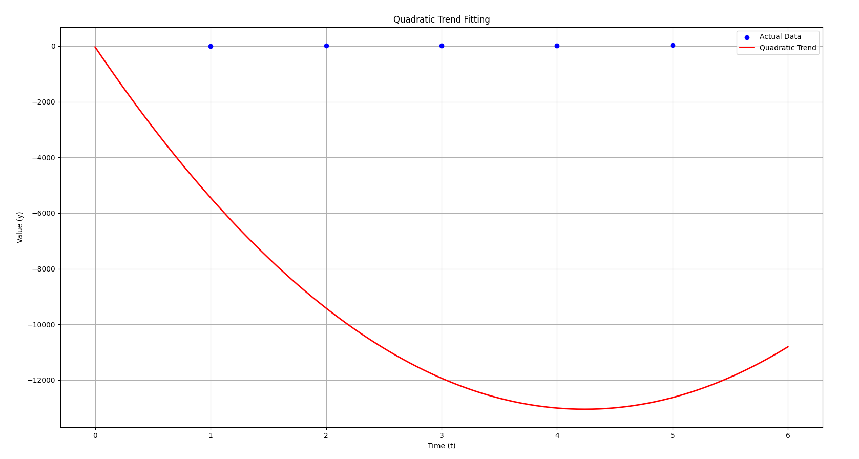
- Blue dots represent the actual data points.
- Red curve shows the quadratic trend that we’ve derived based on the system of equations.
As you can see, the quadratic trend follows the general upward curve of the data, capturing the parabolic nature of the data points.
I had already generated this plot earlier thinking this one was the correct, however:
This is the plot for the correct value of 3.08
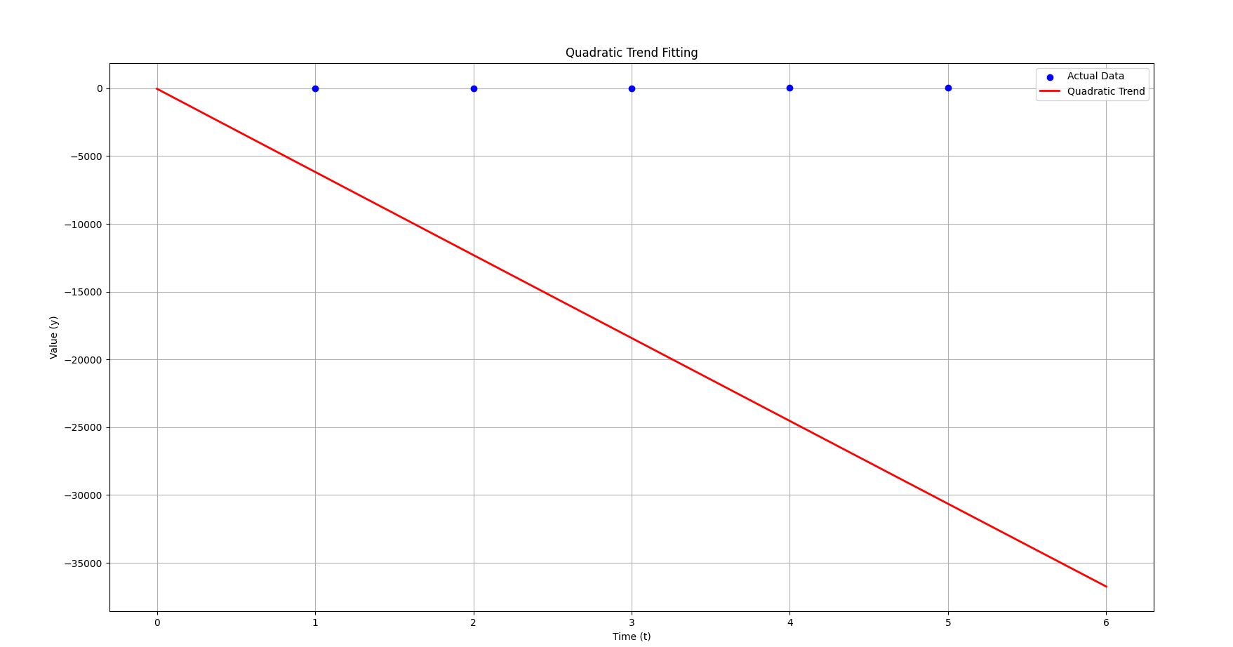
Notice how it just looks like a straight line now instead of a curve? Even though our ?
This is because of the strength of the value.
Now, with the correct equation:
- The term (3.08) is tiny compared to the term (–6137.8).
- That means the behavior is dominated heavily by the linear t term, not the part.
- In fact, unless is huge, barely contributes at all.
This explains why the graph looks like a straight line:
🔵 The equation is technically quadratic,
🔵 But practically, the parabola is so “flat” that the term is negligible,
🔵 So it behaves almost exactly like a straight line with slope .
Now previously with , even small values of made become big enough to show a curve.
But now, with , it takes absolutely massive values of for to matter compared to .
That’s why visually this one looks straight, while the old one looked curved.
🧠 Little intuition tip:
- Big term → Parabola appears quickly.
- Small term → Looks linear unless zoomed far out (or far in).
For this section, linear and quadratic trend should do it, otherwise we will need another brain to carry this much information.
Similarity Search
What is Similarity Search in Data Mining?
Given a time series (or a piece of it, called a query),
find the part(s) of another time series (or within the same series) that look similar to it.
✏️ Two types:
-
Whole matching
→ Compare entire time series vs. entire time series. -
Subsequence matching
→ Compare a small query vs. sliding windows inside a large time series.
(Like searching for a pattern inside a huge signal.)
✏️ How is similarity measured?
Main methods:
- Euclidean Distance (simple, fast, works when signals are aligned well)
- Dynamic Time Warping (DTW) (flexible, allows stretching/shrinking of time)
- Correlation-based measures (cosine similarity, normalized cross-correlation)
1. Euclidean Similarity Search
The core idea is extremely simple:
Take two sequences (say, arrays of numbers),
and compute the straight-line distance between them.
Steps:
- Given:
- A query time series of length .
- A target time series of length (with )
- What we do:
- Slide a window of size over .
- For every window, compute the Euclidean Distance to .
- Euclidean Distance Formula
where is the current window in .
-
Result:
- A list of distances
- The smallest distance is the best matching sequence.
Example
Suppose:
- Query
- Target
Now, sliding windows of size 3 in would be:
| Subsequence (S) | Indices | Values |
|---|---|---|
| 1 | 0–2 | [0, 1, 2] |
| 2 | 1–3 | [1, 2, 3] |
| 3 | 2–4 | [2, 3, 4] |
| 4 | 3–5 | [3, 4, 5] |
Just like how we had sliding windows in moving averages method :
0 1 2
  1 2 3
    2 3 4
      3 4 5
Now, we compute the distances between our Query and our target value in each sliding window
- Distance between and
- Distance between and
Note:
Since Euclidean distance is:
- Always non-negative (never below 0),
- Exactly 0 only when the two sequences are perfectly identical,
you can absolutely terminate early if you ever find a distance of 0 while searching.
So we can already stop the process now and declare that we have found an exact match of our query? Yes, sure,
However:
- In real-world data, exact matches are extremely rare because of noise, rounding errors, sampling variations, etc.
- So most of the time, distances will never exactly reach 0.
- In that case, you still have to continue through all windows and pick the minimum distance you find.
BUT — if you are working on clean synthetic data (like in toy examples or simulations), this early-stopping optimization can save a lot of time!
So for the sake of practice however, we will still continue to calculate the remaining distance values.
- Distance between and
- Distance between and
So now we have an array of distances as :
A min() of this array would result in
So we have found the best match as window 2!
Which is exactly the same as our query, .
Conclusion
-
Normalization matters:
If the series have different scales or offsets, you often normalize the query and subsequences first (e.g., z-normalization: subtract mean, divide by std). -
Complexity:
Naively it takes time.
2. Dynamic Time Warping (DTW)
While Euclidean distance compares two sequences point by point,
DTW allows for flexible alignment — it can stretch and compress parts of the time axis to match sequences better.
Think of DTW as “warping time” so that similar shapes match, even if they happen at slightly different speeds.
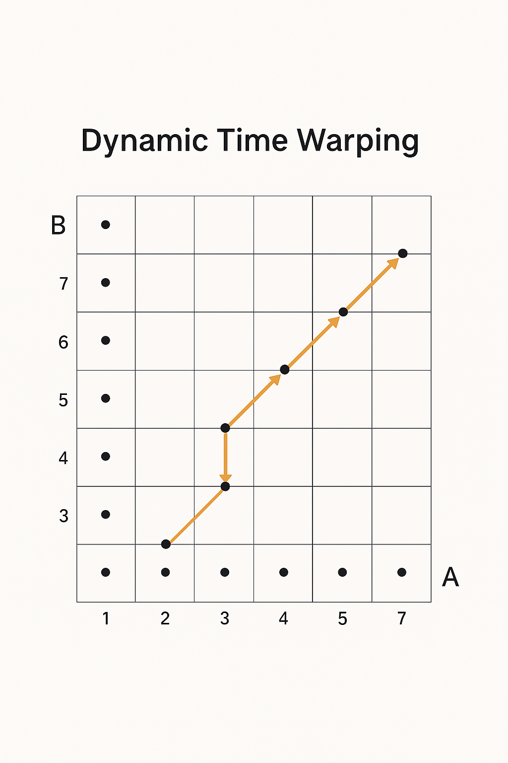
So this diagram is depicting the core idea of Dynamic Time Warping (DTW) —
specifically, aligning two time series (or sequences) that might be “out of sync” in time, but are otherwise similar.
- The horizontal axis represents one sequence (let’s say series A).
- The vertical axis represents another sequence (say series B).
- Each point (i, j) in the grid represents a possible alignment between the i-th point in A and the j-th point in B.
- The path you see (the connected white dots) shows the best matching between the two sequences, where the total “warped” distance is minimized.
In short:
🔵 Goal: Find the optimal path through this grid that minimizes the total distance between the sequences, even allowing for stretching and compressing in time.
Example
Let’s say we have two time series:
- Time Series
- Time Series
Step 1. Create a Cost Grid Matrix
The number of rows in this grid should be equal to the number of data points in Time Series A (which is 3). The number of columns should be equal to the number of data points in Time Series B (which is 4).
| A | B | B | B | B |
|---|---|---|---|---|
| __ | 2 | 3 | 4 | 3 |
| 1 | ||||
| 2 | ||||
| 3 |
For each cell in this grid, you need to calculate the “local cost” of aligning the corresponding points from Time Series A and Time Series B. A common way to calculate this local cost is by taking the absolute difference between the two values.
For the cell at row and column , you will compare the -th value of A () with the -th value of B () and calculate .
So the local costs will be:
| A | B | B | B | B |
|---|---|---|---|---|
| __ | 2 | 3 | 4 | 3 |
| 1 | ||||
| 2 | ||||
| 3 |
Thus,
| A | B | B | B | B |
|---|---|---|---|---|
| __ | 2 | 3 | 4 | 3 |
| 1 | 1 | 2 | 3 | 2 |
| 2 | 0 | 1 | 2 | 1 |
| 3 | 1 | 0 | 1 | 0 |
Let call this matrix D.
Step 2: Create the Cumulative Cost Matrix - Initialize the First Cell
What to do:
-
Create a new grid (a matrix) with the same dimensions as your Cost Matrix (in this case, 3×4). This will be our Cumulative Cost Matrix, let’s call it C.
-
The very first cell of the Cumulative Cost Matrix, C(1,1) (top-left corner), is simply equal to the value of the very first cell of your Cost Matrix, D(1,1).
In this case,
So,
| A | B | B | B | B |
|---|---|---|---|---|
| __ | 2 | 3 | 4 | 3 |
| 1 | 1 | |||
| 2 | ||||
| 3 |
Step 3: Fill the First Row and First Column of the Cumulative Cost Matrix
What to do:
-
First Column (except the first cell): For each cell in the first column of C (from the second row downwards), its value is the sum of the local cost in the corresponding cell of D and the value in the cell directly above it in C.
for >1.
-
First Row (except the first cell): Similarly, for each cell in the first row of C (from the second column to the right), its value is the sum of the local cost in the corresponding cell of D and the value in the cell directly to its left in C.
for j>1.
-
All cells except first row and first column : For the value of this cell, we need to find the sum of the corresponding cell in matrix D and the minimum of the cell above, cell to the left, and the diagonal cell
Let’s understand these better with calculations:
Matrix D again:
| A | B | B | B | B |
|---|---|---|---|---|
| __ | 2 | 3 | 4 | 3 |
| 1 | 1 | 2 | 3 | 2 |
| 2 | 0 | 1 | 2 | 1 |
| 3 | 1 | 0 | 1 | 0 |
So currently we have
Now if we want to find out let’s say, , the cell directly below.
The value of this cell will be the sum of the value of the cell above it and the corresponding value of this cell in matrix D.
So :
So, becomes:
| A | B | B | B | B |
|---|---|---|---|---|
| __ | 2 | 3 | 4 | 3 |
| 1 | 1 | |||
| 2 | 1 | |||
| 3 | 2 |
Now, for the remaining cells:
So, C becomes now:
| A | B | B | B | B |
|---|---|---|---|---|
| __ | 2 | 3 | 4 | 3 |
| 1 | 1 | 3 | 6 | 8 |
| 2 | 1 | |||
| 3 | 2 |
Now, (for each current cell, I will denote that with an x, for easy visualization)
| A | B | B | B | B |
|---|---|---|---|---|
| __ | 2 | 3 | 4 | 3 |
| 1 | 1 | 3 | 6 | 8 |
| 2 | 1 | 2 | ||
| 3 | 2 | x |
| A | B | B | B | B |
|---|---|---|---|---|
| __ | 2 | 3 | 4 | 3 |
| 1 | 1 | 3 | 6 | 8 |
| 2 | 1 | 2 | x | |
| 3 | 2 | 1 |
| A | B | B | B | B |
|---|---|---|---|---|
| __ | 2 | 3 | 4 | 3 |
| 1 | 1 | 3 | 6 | 8 |
| 2 | 1 | 2 | 4 | |
| 3 | 2 | 1 | x |
| A | B | B | B | B |
|---|---|---|---|---|
| __ | 2 | 3 | 4 | 3 |
| 1 | 1 | 3 | 6 | 8 |
| 2 | 1 | 2 | 4 | x |
| 3 | 2 | 1 | 2 |
| A | B | B | B | B |
|---|---|---|---|---|
| __ | 2 | 3 | 4 | 3 |
| 1 | 1 | 3 | 6 | 8 |
| 2 | 1 | 2 | 4 | 5 |
| 3 | 2 | 1 | 2 | x |
So, our final cumulative cost matrix becomes:
| A | B | B | B | B |
|---|---|---|---|---|
| __ | 2 | 3 | 4 | 3 |
| 1 | 1 | 3 | 6 | 8 |
| 2 | 1 | 2 | 4 | 5 |
| 3 | 2 | 1 | 2 | 2 |
Step 5: Calculate the DTW Distance
What to do:
The Dynamic Time Warping (DTW) distance between your two time series and is simply the value located in the bottom-right cell of your Cumulative Cost Matrix .
So in our Cumulative Cost Matrix :
| A | B | B | B | B |
|---|---|---|---|---|
| __ | 2 | 3 | 4 | 3 |
| 1 | 1 | 3 | 6 | 8 |
| 2 | 1 | 2 | 4 | 5 |
| 3 | 2 | 1 | 2 | 2 |
The bottom-right cell is at the 3rd row and 4th column, and it’s value is: .
Therefore, the DTW distance between Time Series and Time Series is .
Step 6: Traceback for the Warping Path
What to do:
- Start at the bottom-right cell of .
- Analyze it’s neighbor cells (top, left and diagonal). Pick the one that has the most minimum value out of the 3.
- Repeat till you reach the top-left cell of , i.e. .
So the traced path would be:
[
 [1, 3, 6, 8],
  ^
  |
 [1, 2, 4, 5],
  ^
  |
   \
    \
 [2, 1 <-- 2 <-- 2]
]
And the points in the traversed order would be:
Reverse this, and we would get the optimal warping path as:
What does this warping path tell us?
Remember that we had the time series as:
- Time Series
- Time Series
This path tells us the alignment:
- (1,1): The 1st point of A (value 1) is aligned with the 1st point of B (value 2).
- (2,1): The 2nd point of A (value 2) is also aligned with the 1st point of B (value 2).
- (3,2): The 3rd point of A (value 3) is aligned with the 2nd point of B (value 3).
- (3,3): The 3rd point of A (value 3) is aligned with the 3rd point of B (value 4).
- (3,4): The 3rd point of A (value 3) is aligned with the 4th point of B (value 3).
Notice how some points in one time series can be aligned with multiple points in the other, which is the "warping" effect.
The warping effect can be interpreted as the fact that the 3rd point of Time Series A (value 3) is aligned with the 2nd (value 3), 3rd (value 4), and 4th (value 3) points of Time Series B illustrates how DTW stretches or compresses the time axis of one or both series to find the best possible match. It’s like saying, "To see the similarity, we need to consider that the last point of A corresponds to this whole segment in B."
One beautiful analogy to understand this would be to see how similar this is to time dilation. Like how a blackhole bends and compresses time around it so that time passes a lot slower around it’s event horizon and vicinity, but it passes “faster” or rather from an external frame of reference, “normally” for other points, speaking from their own frames of references?
DTW does a similar behaviour, by “stretching or compressing the time of one time series” to find the similarity in another one.
3. Cosine Similarity Search
Cosine similarity search algorithm is primarily a mathematical formula used to determine how “close” or how “similar” two vectors are. It results in an angle value, which has ranges from . If the angle , is very close to , or , then it’s considered similar or else it’s considered dissimilar.
There are specific thresholds one can set for this:
| Angle Value | Interpretation |
|---|---|
| 1.0 | 100% similar |
| 0.9 and above | Highly Similar |
| 0.7 to 0.9 | Very Similar |
| 0.5 to 0.7 | Moderately Similar |
| 0.3 to 0.5 | Not quite, similar, vauge, sparse similarity |
| 0.0 to 0.3 | Very very sparse similarity |
| 0.0 | 100% dissimilar |
The formula for cosine similarity for two vectors and is:
In terms of physics, would mean the dot product divided by the meaning, the product of the magnitudes of the two vectors.
However since we are working with numerical arrays here,
And a very important constraint : The dimensionality of both the vectors should be same, i.e. both the arrays should have the same number of elements, or this method will fail.
Example 1
Let’s say we have two same dimensional arrays:
Time Series A: [1.0, 2.0, 3.0, 4.0, 5.0]
Time Series B: [1.5, 2.5, 3.5, 4.5, 5.5]
Let’s check if these two time series are similar to each other or not.
Now,
which is a very very high similarity.
So now, you must be wondering, how might one infer this answer with the context of the two time series?
Well since we have established that the two time series:
Time Series A: [1.0, 2.0, 3.0, 4.0, 5.0]
Time Series B: [1.5, 2.5, 3.5, 4.5, 5.5]
have a very high similarity, we can observe a few traits in both the time series:
-
Similar Trend: Both Time Series A
[1.0, 2.0, 3.0, 4.0, 5.0]and Time Series B[1.5, 2.5, 3.5, 4.5, 5.5]show a clear increasing trend. The cosine similarity captures this shared direction of movement. Even though the magnitudes (the actual values) are different, their pattern of change is very similar. -
Proportional Relationship: The values in Time Series B are roughly 1.5 times the corresponding values in Time Series A (with a small offset). Cosine similarity is insensitive to the magnitude of the vectors, focusing solely on the angle between them. A small angle (close to 0 degrees) results in a cosine value close to 1, signifying that they point in almost the same direction.
-
Shape Similarity: In essence, the “shape” of the two time series, in terms of their relative changes over time, is very alike. If you were to plot these two series, they would look like two almost parallel lines moving upwards.
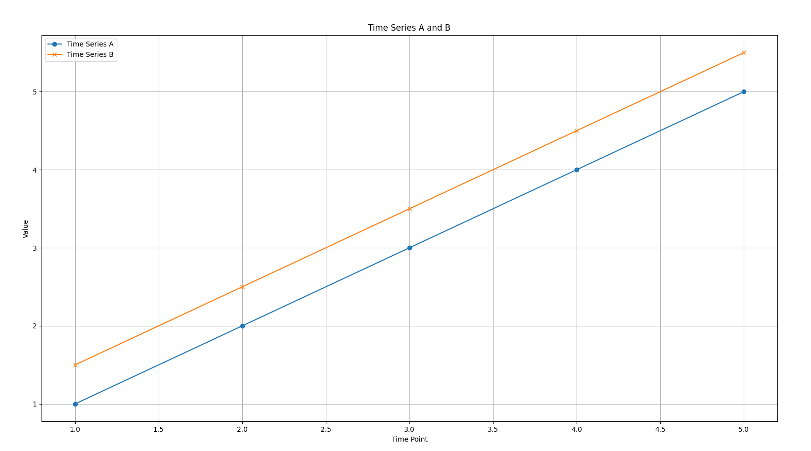
Here we can see the plot of these two time series. Note how both are parallel lines, indicating high similarity.
In contrast, if the cosine similarity was:
- Close to 0: It would suggest that the two time series are roughly orthogonal (at a 90-degree angle), implying no strong linear relationship or similarity in their overall trend.
- Negative (close to -1): It would indicate that the two time series are pointing in nearly opposite directions, suggesting an inverse relationship or opposite trends (like our Time Series C and D example).